Summary Statistics & Frequency Tables
In this lesson you will learn a few such important functions to derive summary statistics and frequency tables; two very important first steps in any analysis.
In this lesson however, we use the Titanic data set which is already built in with Seaborn library.
head/tail/sample functions
Looking at the first few records, last few records or randomly checking a few records is what any data analyst would do at some point of time while analyzing the data and here are the functions to do exactly that.
titanic_df.head(3)
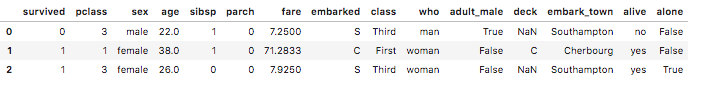
The head method on a DataFrames takes in an optional integer parameter and returns the top rows of the table. If no argument is given, then it returns the top 5 rows, else, it returns the number of rows equal to the argument passed.
Note: You can enclose the titanic.head(3) within a print statement also. In the Jupyter notebook, print is optional for the statement which is the last line in the code cell. Otherwise print is required to see the output.
Related functions
- tail is also on the same lines except this command returns the last 5 rows of the table by default.
- sample is also on the same lines except this command randomly picks up rows from the table.
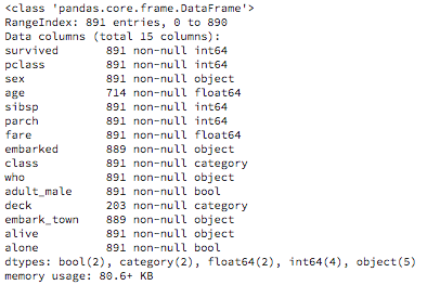
info
The next important function on any table is to have a cursory glance on the table data and have an idea on the number and names of columns, column data types, number of null values in the data etc. For this we use the info method on the DataFrame
import pandas as pd

titanic_df = pd.read_csv('datasets/titanic.csv')
titanic_df.info()
Output:
describe
One of the simplest exploratory analytics artifact would be to generate the summary statistics of your data. DataFrame has one simple easy function describe, to produce some of the important summary statistic values like mean, median, minimum, count etc., which saves you 10's of lines of code in Python or Numpy to calculate the same set of values!
When you invoke describe function on a DataFrame, it generates summary values across all numerical columns displaying the column wise central tendencies, dispersion etc.. Non numerical columns are ignored when you apply describe at the DataFrame level.
titanic_df.describe()
Output:
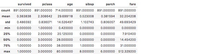
In the titanic data you can note from the 'age' column that the mean age of the passengers is 29.69, median ( 50 %) age is 28, standard deviation (std) is 14.52, the oldest traveller was 80 years old and youngest was 0.42 years old.
Imagine the number of lines of code you would have written in Python to calculate all these values! Although the calculations are shown for all the numerical columns, the 'age', 'fare', 'survived', 'pclass' columns are probably more interesting.
If you are wondering about the type of data in these columns, here is the rundown:
| Column | Meaning | Categorical/Continuous |
|---|---|---|
| survived | Survived the tragedy | 0 = No, 1 = Yes |
| pclass | Ticket class | 1 = 1st, 2 = 2nd, 3 = 3rd |
| sibsp | # of siblings / spouses aboard the Titanic | continuous |
| parch | # of parents / children aboard the Titanic | continuous |
| embarked | Port of Embarkation | C = Cherbourg, Q = Queenstown, S = Southampton |
Although applying describe on a DataFrame does not yield results on a non-numerical column, you can however apply describe on individual non-numerical column. Here is an example
titanic_df.embarked.describe()
Output:

Applying describe function directly on a column will not show the summaries like mean, std etc., however you will get results which are relevant to that categorical value.
nlargest/nsmallest
To get top 'n' sorted rows on a column, you would use the nlargest function by giving the column name to sort on. To get the top 4 entries of the oldest passengers in the titanic data you would write the below code:
titanic_df.nlargest(4,'age')

Complementary to that is nsmallest. To get the youngest 4 passengers on titanic you would write:
titanic_df.nsmallest(4,'age')
corr
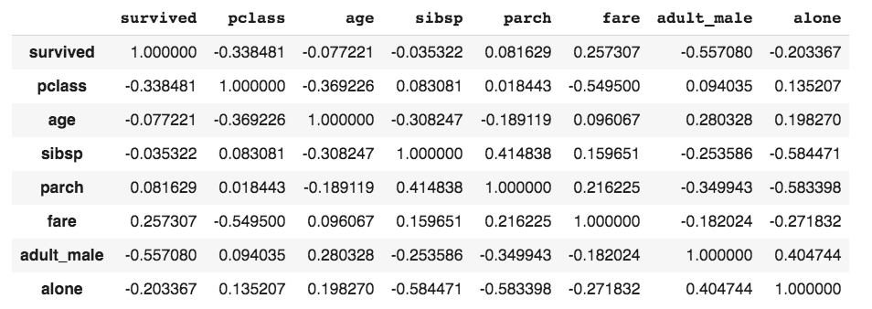
To find correlations between numerical column values in a DataFrame, you can use the corr function on the DataFrame. Here is an example:
titanic_df.corr()
corrWith function
To find the correlation between one column and the rest of the columns, you would use the corrWith function. Supposing you only want to find the correlation between the 'fare' column and the rest of the columns in titanic then you would write the below code:
titanic_df.corrwith(titanic['fare']).nlargest(10)
Output:
fare          1.000000
survived      0.257307
parch         0.216225
sibsp         0.159651
age           0.096067
adult_male   -0.182024
alone        -0.271832
pclass       -0.549500
dtype: float64
By using nlargest we are only getting the 10 highest correlations in which the 'fare' column should be ignored as there is no meaning in saying 'fare' is highly correlated to 'fare'! Among the ones which make sense, we see that there is a slight positive correlation between 'fare' and 'survived' and negative correlation between 'fare' and 'pclass' Which means people who paid more fare had a better chance of survival and since pclass 1 was the costliest, there is a negative correlation between the pclass value and the fare.
Note: Only numerical columns should be selected in the dataframe before corrwith is used.
value_counts
To create a frequency table of any column values, you can use the value_counts function. Here is an example of getting the frequency table for the embark_town column of the titanic dataset
df.embark_town.value_counts()
Southampton    644
Cherbourg      168
Queenstown      77
To get the relative frequency table of the same column, you can add the keyword argument normalize=true. Here is the example
df.embark_town.value_counts(normalize=True)
Southampton    0.724409
Cherbourg      0.188976
Queenstown     0.086614
You can multiple the expression by 100 to get percentages;
df.embark_town.value_counts(normalize=True) * 100
Set Options
When you print a dataframe which has too many columns and rows, you will see ellipses in place of column names and rows.
chicago_schools = pd.read_csv("https://data.cityofchicago.org/resource/5tiy-yfrg.csv")
chicago_schools
Run the above example and you will see ellipses in the middle of column listings and row listings.

This is because the default display options for max_rows and max_columns are 60 and 20 respectively. To find the default option values you would run the below statements:
print(pd.get_option('max_rows'))
print(pd.get_option('max_columns'))
In case you want to see all the columns and/or rows then you can change the default display setting by resetting the options as shown below. There are two ways of setting this value and both the ways are shown below, using one method for each setting:
pd.set_option('display.max_columns', None)
pd.options.display.max_rows = None
Default settings are there for a reason - performance! For large datasets, you run the risk of slow page loads and/or complete crash of the page as your system runs out of memory to show the markup of all columns and rows.
Instead of setting it to None, you could put any other number as well. Typically, setting the rows to 10 is popular.