Visualizations
'A picture is worth a thousand words' is not a hearsay idiom. It is indeed a fact. Nothing speaks louder and clearer than pictures when it comes to Data Analytics. A complex relationship between multi variants can be conveyed with just a single plot. A correlation graph conveys meaning or essence of its relationship more effectively than a lengthy description does. In this lesson you will explore how to create meaningful visualizations using Matplotlib and Seaborn libraries.
Simple Visualizations With Matplotlib
Although for sophisticated visualizations we tend to use Seaborn libraries, you can use Matplotlib for simple diagrams or when you need more flexibility with your diagrams. Matplotlib is a low level visualization library for Python which provides more fine grained access to functions to help customize your diagrams.
Here are a few examples of simple plots using Matplotlib:
Line charts
The basic line plotting just needs the 'x' and/or 'y' numerical values for plotting. If only 'x' is given then the index values of 'x' is plotted on the 'x' axis and 'y' axis displays the 'x' values. Here are some examples:
import matplotlib.pyplot as plt
import numpy as np
x = np.arange(1, 10)
plt.plot(x * 2)
plt.title('Simple line plot example')
plt.xlabel('x-axis shows the index values of x')
plt.ylabel('2x values')
print(x)
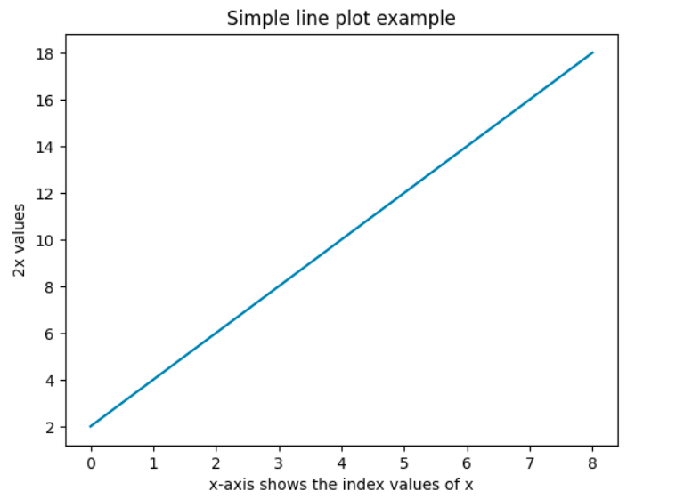 In the above code, we first import the pyplot module of the Matplotlib library and give it an alias 'plt' and then use the 'plot' function.
In the above example, the x-axis is index array corresponding to the length of 'x' and the y-axis has tha actual values of the expression 'x * 2'.
To change the line style, check the examples in the 'Styling in matplotlib' section below.
Histogram
Suppose you want to see the frequency distribution of the continuous values of age in the sample data of Titanic travellers, you could use plot a histogram as shown below:
 import matplotlib.pyplot as plt
 import seaborn as sns
 titanic = sns.load_dataset('titanic')
 plt.hist(titanic.age.dropna())
 plt.title('Age Distribution Of Travellers')
 plt.xlabel("age")
 plt.ylabel("# of travellers (frequency)")
 plt.show()
Output:
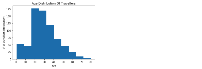
Note that we dropped all the NaN values of age by invoking the dropna() function on the age column values. If you do not drop the invalid values, your plot will throw errors as the hist function expects you to give all valid values without nan's. The bin size is automatically calculated by the library, however we can specify bin size if required. We also set the title, x and y labels and finally invoked the show() function. There are many other parameters that you can set. Refer official documentation for details: https://matplotlib.org/api/_as_gen/matplotlib.pyplot.hist.html
Bar chart
Suppose you want to see the total number of people who embarked from different towns, you would write the below code:
count_by_embark = titanic.groupby('embark_town').size()
plt.bar(count_by_embark.index, count_by_embark)
plt.title('Embarked Towns')
plt.ylabel("total of travellers")
plt.show()
Output:
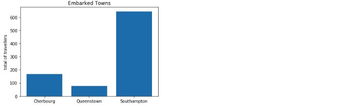
Code for the bar chart is very similar to the histogram. Note that first you use the grouby function to help group the distinct values of embark_town and then use the index values for 'x' axis and the grouped values for the 'y' axis. Here too you can set many other parameters; reference the documentation for details: https://matplotlib.org/api/_as_gen/matplotlib.pyplot.bar.html
Instead of using groupby you can also use value_counts function on the embark_town column. Here is the alternative way of getting the same diagram:
plt.bar(titanic['embark_town'].dropna().unique(), titanic['embark_town'].value_counts())
plt.title('Embarked Towns')
plt.ylabel("total of travellers")
plt.show()
However note that if you do not drop the na values for the 'x' axis, it gives you an error as it tries to convert nan to a String type and fails.
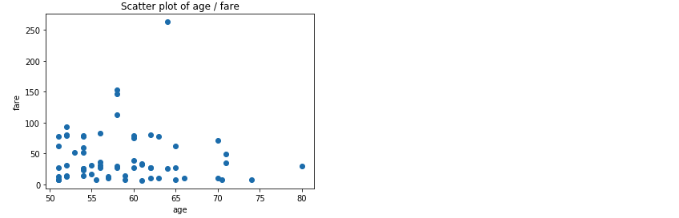
Scatter plot
If you want to see the fare that people over 50 years of age paid as a scatter plot you would execute the below code:
plt.title('Scatter plot of age / fare')
plt.ylabel("fare")
plt.xlabel("age")
plt.scatter(titanic[titanic.age > 50].age, titanic[titanic.age > 50].fare)
Output:
Sub plots in Matplotlib
Plots in matplotlib are drawn within a 'Figure' object. So far we have been using the default 'Figure' and 'subplot' which gets created when you directly invoke 'plot' on the 'plt' object. If you invoke plot multiple times within the same code block, then the last figure and subplot will get reused.
To create multiple suplots we will have to get the handle on this Figure object. You can create this using plt.figure(). Once you have a handle on the 'Figure' object you can add as many subplots as you like. Here is an example:
fig = plt.figure()
ax1 = fig.add_subplot(2, 2, 1)
ax2 = fig.add_subplot(2, 2, 2)
ax3 = fig.add_subplot(2, 2, 3)
ax4 = fig.add_subplot(2, 2, 4)
Output:
The arguments 2, 2, 1 for the first subplot tells the fig to create a layout of 2 rows and 2 columns and then assign the first position to this subplot. For the other subplots the numbers change to occupy the other positions in the layout.
However since nothing is plotted, the plots are empty. Now we will add plots to each one as shown below:
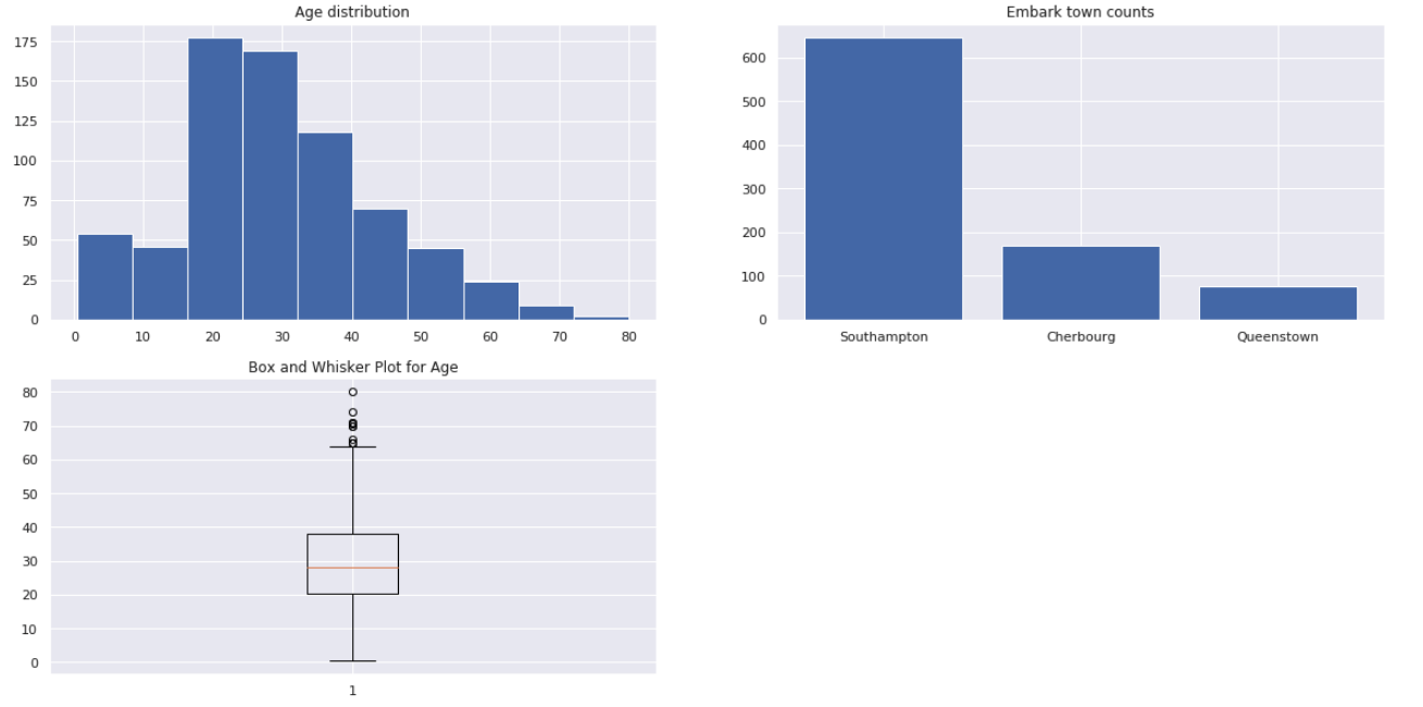
fig = plt.figure()
ax1 = fig.add_subplot(2, 2, 1)
ax2 = fig.add_subplot(2, 2, 2)
ax3 = fig.add_subplot(2, 2, 3)

ax1.hist(titanic_df['age'].dropna())
ax1.set_title("Age distribution")

agg1 = titanic_df['embark_town'].value_counts();
ax2.bar(agg1.index,agg1.values)
ax2.set_title("Embark town counts")

ax3.boxplot(titanic_df['age'].dropna(),vert=True)
ax3.set_title("Box and Whisker Plot for Age")
Output:
You can also get the 'Figure' and subplots in one statement; e.g., fig, axes = plt.subplots(2, 3)
and you can get the specific subplot using the 2-dimensional array notation; e.g., axes[0, 0] gets you the subplot in first row,
first column.
Here is another variation:
fig, [ax1, ax2] = plt.subplots(nrows=1, ncols=2)
You can also specify if the y-axis or x-axis should be shared among subplots or not and many more options are available. Refer for more options: https://matplotlib.org/api/_as_gen/matplotlib.pyplot.subplots.html
Styling in matplotlib
You can specify color, markers and linestyle for your subplots by passing on the respective attributes. Here are a few examples;
Given x and y values, to get a dashed green line plot you could use one of the below methods
subplot.plot(x, y, 'g--')
subplot.plot(x, y, linestyle='--', color='g')
Here is another example to change the marker to 'x' and the line color to blue with a regular line;
plt.plot(pd.np.random.randn(30).cumsum(), 'bx-')
The above plot can also be drawn by setting the individual attributes for marker, linestyle, color etc., as shown below;
plt.plot(pd.np.random.randn(30).cumsum(), color='b', linestyle='solid', marker='x')
randm(30) function returns 30 sample random numbers from standard normal distribution which contains both positive and negative floating point numbers. cumsum function derives cumulative sum of these random numbers. You can also drop this cumsum and just plot the random numbers in which case the y-axis will have the random value and the x-axis will have the index position of the number.
To apply grid lines; for both 'x' and 'y' axis, you can use the function:
plt.grid()
To change the font of the labels, you an set the 'fontsize' keyword argument when invoking the 'xlabel' and 'ylabel' functions.
Simple Visualizations With Pandas
If you noticed we converted all the Series objects to list and fed them to the Matplotlib plotting functions in the above diagrams. However, Pandas Series and DataFrame data structures also supports charts directly without the need to convert to any other structure while still using Matplotlib underneath its functions. Here are a few examples:
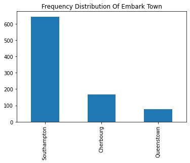
Using value_counts() on a Series object
You can directly apply value_counts() function on a Series containing categorical data to get an aggregation of individual categories. Using value_counts() returns another Series object. To this object you can directly apply the plot function specifying the type of plot as shown below:
df['embark_town'].value_counts().plot(kind='bar', title='Frequency Distribution Of Embark Town')
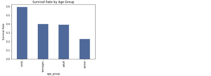
Using groupby result
Instead of using the valuecounts(), you could also use the _groupby function as shown below:
survived_by_age_group = titanic.groupby('age_group')['survived'].mean()
print(survived_by_age_group)
subplot = survived_by_age_group.plot.bar(
            color='#5975A4',
            title='Survival Rate by Age Group')
subplot.set_ylabel('Survival Rate')
Output:
Note that in the above examples, you see the 'bar' function applied on the 'plot' directly. However you can instead use the 'plt' functions shown in previous examples.
bar chart with Pareto diagram
import pandas as pd
import matplotlib.pyplot as plt
import seaborn as sns

df = sns.load_dataset('titanic')

s1 = df.embark_town.value_counts(normalize = True)* 100
fig, axes = plt.subplots()
s1.plot(kind='bar', ax=axes, color='yellow')

s2 = s1.cumsum()
s2.plot (use_index = True, kind='line', ax=axes, secondary_y=True, color='red', marker='x')

x_ticks = axes.get_xticks()
axes.right_ax.set_ylim(ymin=0, ymax=110)
for index, value in enumerate(s2):
  axes.right_ax.text(x_ticks[index], value+3, f"{value:.0f}%", color='red')

fig.legend(['Absolute Frequency', 'Cumulative Relative Frequency (pareto)'])
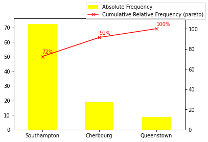
In the above example, you see that we have created the axes subplot and used the same 'axes' to plot two different charts. The cumsum function computes the cumulative sum of the frequency values that is shown in this pareto chart.
Note: A Pareto chart (named after Pareto) contains both bars and a line graph, in which the values are represented in descending order by bars, and the line graph shows the cumulative total with the final value being at 100%. The left y-axis shows the frequency count and the right y-axis shows the cumulative percentage. Pareto also came with the famous 80-20 rule that asserts that 80% of outcomes result from 20% of all causes for any given event. In practice, the 80-20 rule is to identify outcomes that are potentially the most significant that needs to be addressed first and a Pareto will highlight the 80% pretty easily.
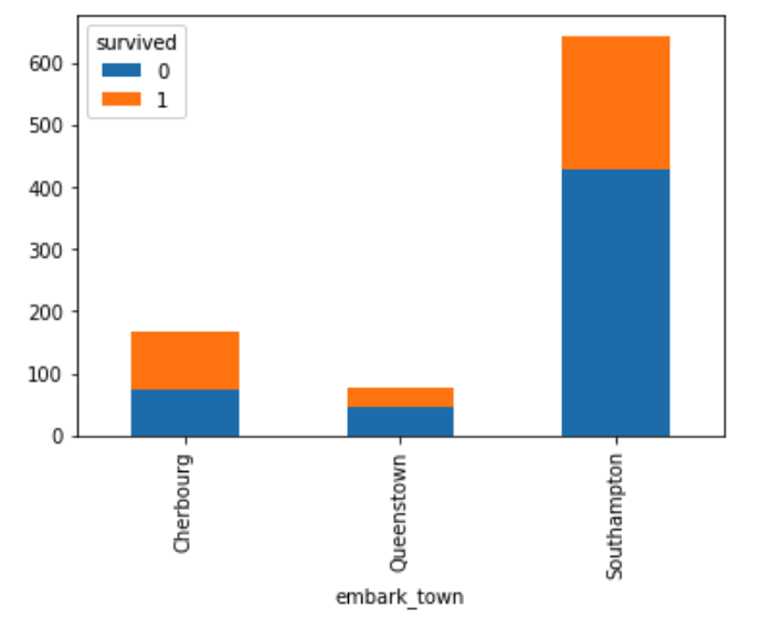
Stacked bar
To show the total number of surived vs dead across each of the embark towns, you can do a groupby on both the columns; 'embark_town' and the 'survived' column.
titanic_df.groupby(['embark_town', 'survived']).size()
To show the results as a stacked bar chart, you would first unstack the result and then plot the bar with the attribute 'stacked=True' set, as shown below:
unstacked = titanic_df.groupby(['embark_town', 'survived']).size().unstack()
unstacked.plot(kind='bar', stacked=True)
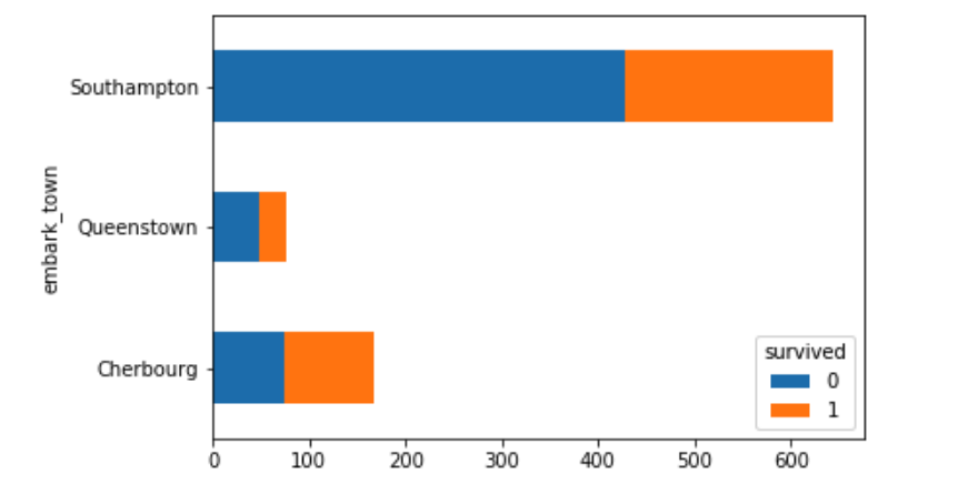
To show the same graph horizontally you would change the kind to 'barh' as shown below. You can change the color of your bar charts by adding the color attribute as shown:
unstacked = titanic_df.groupby(['embark_town', 'survived']).size().unstack()
unstacked.plot(kind='barh', stacked=True, color=('#ffaaaa', '#aaffaa'))
Apply plot function on numerical column
You can directly apply the plot function on any of the numerical columns to get a distribution. Here is an example:
titanic["pclass"].plot(kind='hist')
Output:
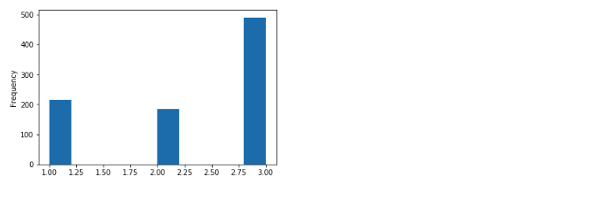
Question: Is this truly a numerical value that should be shown as a histogram? Not really! Even though the column value is a number, 'class' is a categorical value and as such a bar chart would be a better representation.
Another numerical example which is indeed a candidate for a 'histogram'
titanic["age"].plot(kind='hist')
Output:
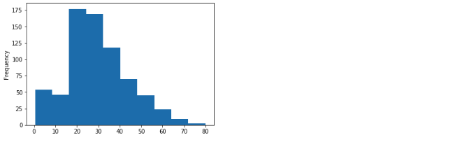
Note in the above we did not even have to use dropna() on the column values. Pandas automatically handles the invalid values and draws a plot for valid value unlike Matplotlib.
Missing values are dropped, left out, or filled depending on the plot type. The way Pandas handles missing values are as follows:
| Plot Type | NaN Handling |
|---|---|
| Line | Leave gaps at NaNs |
| Line (stacked) | Fill 0’s |
| Bar Fill | 0’s |
| Scatter | Drop NaNs |
| Histogram | Drop NaNs (column-wise) |
| Box | Drop NaNs (column-wise) |
| Area | Fill 0’s |
| KDE | Drop NaNs (column-wise) |
| Hexbin | Drop NaNs |
| Pie | Fill 0’s |
If any of these defaults are not what you want, or if you want to be explicit about how missing values are handled, consider using fillna() or dropna() before plotting.
Official reference
- https://pandas.pydata.org/pandas-docs/stable/visualization.html
- It is always a good practice to have a title, x-axis and y-axis labels in your chart. You can set all these and also change many other visual aids. Please refer to the full documentation on plots: https://pandas.pydata.org/pandas-docs/stable/generated/pandas.DataFrame.plot.html
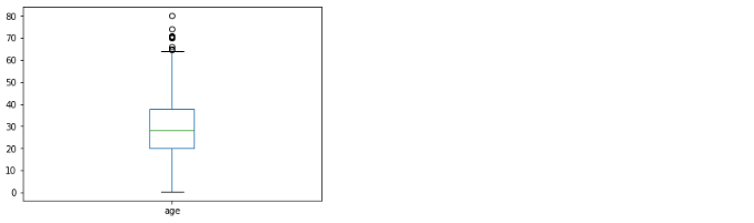
Apply box plot function on numerical column
The box plot (a.k.a. box and whisker diagram) is a standardized way of displaying the distribution of data based on the five summary values: minimum, first quartile, median, third quartile, and maximum. Refer http://www.physics.csbsju.edu/stats/box2.html for more details. You can create a box and whisker plot very easily on pandas numerical column as below:
titanic["age"].plot.box();
Output:
Apply pie chart function on categorical values
If you have 2 to 4 unique categories, then you can also create a pie chart by applying the pie function directly on Pandas Series object. Since all Pandas columns are Series, you can apply directly to a column. In this example we will apply on the groupby result column to derive a colorful pie chart.
separate = [0, 0.05]
pie = titanic_df['alive'].value_counts().plot.pie(
            explode=separate, colors=['pink','yellow'],
            autopct=(lambda p : '{:.2f}%'.format(p)),
            fontsize=20, pctdistance=0.5,
            figsize=(6, 6))
Output:
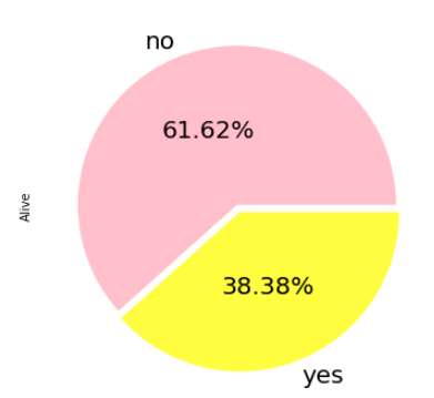
Note, autopct setting enables you to display the percent value using Python regular string formatter applied through a lambda function. In this example the font size of the displayed string is also set along with custom colors for the wedges. As you can image most of these are optional keyword arguments and if not set, will use the default values.
This example also has keyword argument 'explode' set to a list of floating values that is added to separate the pie wedges. The first pie wedge has a separation value set to '0' and the second pie wedge is set to '0.05'. When you have multiple wedges, you can accentuate a specific wedge by providing a separation only for that and keeping the value '0' for others.
To move the label coordinate
Sometimes the wedge labels overlap the main label. In that case you can move the label and here is an example:
pie.yaxis.set_label_coords(-0.25, 0.5)
The label co-ordinates takes an x and y offset from the default axes co-ordinates (0,0) which is left, bottom. 1, 1 is right, top.
Making a Donut Chart
You can add a white circle of required dimension in the middle of the pie to make it a donut chart. Here is the example of the same example shown above in Donut shape
import matplotlib.pyplot as plt
separate = [0, 0.05]
ax = df['alive'].value_counts().plot.pie(
            explode=separate, colors=['pink','yellow'],
            autopct=(lambda p : '{:.2f}%'.format(p)),
            fontsize=20, label='', pctdistance=0.78,
            figsize=(6, 6))

centre_circle = plt.Circle((0, 0), 0.65, fc='white')
# Adding Circle in Pie chart
ax.get_figure().gca().add_artist(centre_circle)

# Adding Title To chart
plt.title('Alive')
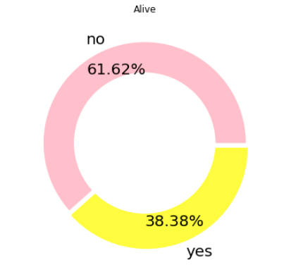
Note the default label is set to an empty string and instead the title is set.
Variations You can also use 'kind=pie' or 'kind=bar' as the attribute for the plot function to get the same effect as a pie and bar chart.
Labels and label orientations
You can change the x-ticks, y-ticks, rotate the ticks etc., using the subplot object. When you use Pandas or Seaborn (explained in the next chapter) to create diagrams, the subplot object is returned by default. You can save this returned object to then tweak the labels, x and y ticks etc.. Here are some example:
- Change the xtick label and rotate them
import pandas as pd
import seaborn as sns

titanic_df = sns.load_dataset('titanic')
ax = titanic_df['pclass'].value_counts().plot(kind='bar')
ax.set_xticklabels(['3rd class', '1st class', '2nd class'], rotation=30)
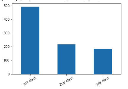
In this you not only changed the default xtick labels but also rotated them by 30 degrees. If you want to keep the original x-ticklabels, then you can change the last statement to
ax.set_xticklabels(ax.get_xticklabels(), rotation=30)
Note: get_xticklabels() will return labels only after the plot is drawn, so add plt.draw() to populate the labels first and then get them using get_xticklabels
Rotation, by default rotates on the center of the text. This sometimes does not align to the vertical bars correctly. In such cases, you can add horizontalalignment='right' keyword argument to set_xticklabels() function.
- Change the xticks
titanic_df = sns.load_dataset('titanic')
az = titanic_df['age'].plot(kind='hist')
az.set_xticks([25, 50, 75, 100])
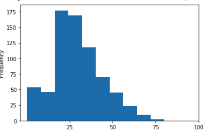
In this the default xticks which were 10,20,30... was changed to new set of xticks. This has not changed the bin size. In the next example you see the bin size changed along with xticks
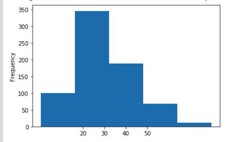
- Change the bin size and the xticks
titanic_df = sns.load_dataset('titanic')
az = titanic_df['age'].plot(kind='hist', bins=5)
az.set_xticks([20, 30, 40, 50])
- Change the x-label and y-label
While you can set the 'title', 'x-label', 'y-label' directly from Pandas api, which in turn sets the corresponding values on the subplots, you can directly set on the subplots itself. Here is an example
ax = titanic_df['age'].plot(kind='hist')
ax.set(xlabel='age')
ax.set_ylabel('count')
Note the two ways of setting the x and y labels; You can set it using the set_ylabel functions (corresponding 'set_xlabel' is also available) or you can just use the set function by setting the keyword arguments for 'xlabel' and 'ylabel' in the set function.
References:
Here is an article on few more tips and tricks on Matplotlib: https://towardsdatascience.com/all-your-matplotlib-questions-answered-420dd95cb4ff