Why Diagrams?
A good Picture is worth more than a 1000 words!
Human eyes works best in understanding patterns when presented with a diagram. Graphs and plots provide unparalleled ability to present overlapping patterns which are recognised quickly by humans compared with reading the same information in a serial, line by line, text form. Human eye is excellent in identifying differences in placement and color
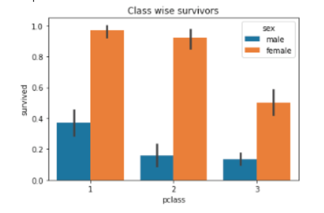
The above pictures represents the survivors in the Titanic disaster. The following are the important variables we see in this chart:
- p-class; there are totally 3 classes in the ship. First class tickets costs the highest while third class costs the least.
- sex; tells if the passenger is male or female
- age; age of the passenger
- survived: value of 1 means survived else died in the tragedy
The x-axis represents sex of the passengers and the y-axis the age. The bar chart also shows classification with respect to p-class along with survived attribute. Even though the information presented in the chart has overlapping variables, we can still understand the pattern very easily. Imagine the same information presented in a text form! It is not only boring to read a lengthy paragraph but it is also difficult to understand the same information as easily as a chart.
Some Diagramming Best Practices
Histogram
Refer this link to see how bin size affects the histogram: http://www.shodor.org/interactivate/activities/Histogram/.
- Bins should include the outliers.
- Boundaries for bins should land at whole numbers whenever possible (this makes the chart easier to read).
- Choose between 5 and 20 bins. The larger the data set, the more likely you’ll want a large number of bins. For example, a set of 20 data pieces might warrant 5 bins but a set of 1000 numbers will probably be more useful with 20 bins. The exact number of bins is usually a judgment call.
- If at all possible, try to make your data set evenly divisible by the number of bins. For example, if you have 20 pieces of data, work with 5 bins instead of 6 or 7.
- A rule of thumb to find the bin interval is (MaxNumber - MinNumber)/Number_of_bins_chosen
Pie and Donut Charts
Do not use them to show year over year changes or any data where you compare two pie charts. It is hard to understand the rate of change by comparing two pie charts. Use paired columns bar charts instead. 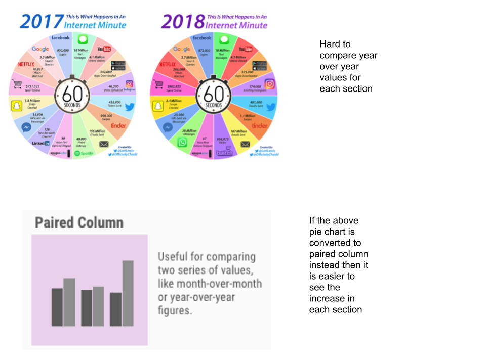
Avoid clutter and show data accurately
Showing too many variables and relationships at once will confuse the reader. Even though during exploratory phase, you can create any kind of diagrams to help you understand the relationships, during explanatory phase, try to highlight only certain relationships by subduing the irrelevant ones.
Also note that if you do not start from 0 on either x or y axis, you will be graphically exaggerating the differences. While this is okay in certain scenarios, be mindful of the inherent exaggeration before showing such charts and explain your intentions.
Avoid using 3D as it does not add any value for data interpretation.
Rules for Color
- Use color only when needed to serve a particular communication goal.
- Use different colors only when they correspond to differences of meaning in the data.
- Use soft, natural colors to display most information and bright and/or dark colors to highlight information that requires greater attention.
- To guarantee that most people who are colorblind can distinguish groups of data that are color coded, avoid using a combination of red and green in the same display.
References
- http://www.perceptualedge.com/articles/ie/the_right_graph.pdf
- http://www.perceptualedge.com/articles/visual_business_intelligence/rules_for_using_color.pdf